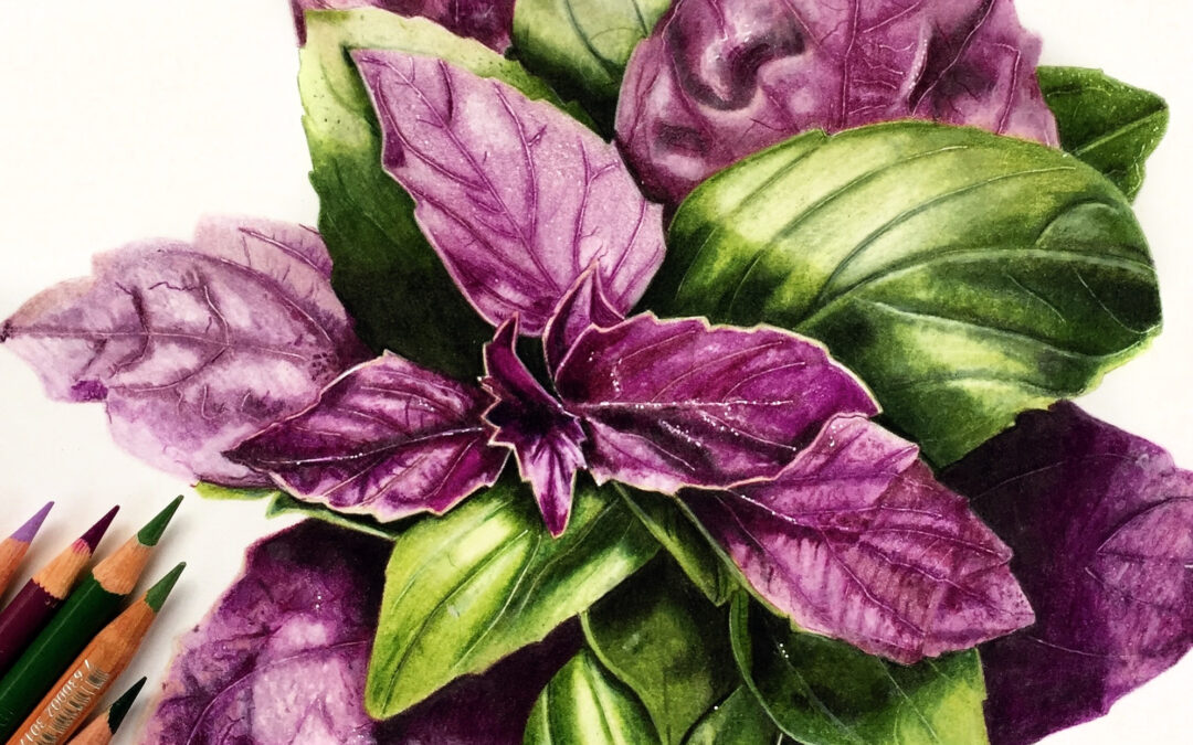
It is all about value! Your colors can be all wrong but if your values are correct, your drawing can still look good. This took me a long time to understand, so I am going to explain it the way it makes the most sense to me.
Value
- relative lightness or darkness of a color
- the relation of one part in a picture to another with respect to lightness and darkness
Here is a good way to think about it. Pick any color, like Prismacolor Scarlet Red. Make a swatch of that color. Layer that same color on top of Cool Grey 70%. Now you have a darker value of your Scarlet Red. Same color, different value.
This is really important when it comes to creating shadows and highlights in your piece. For example, say you need to create a shadow on the petal of a red flower and the COLOR of that shadow appears to be Scarlet Red. But after you fill in the areas around the ‘shadow’, there is no contrast. The shadow doesn’t appear any darker than the rest of the petal. In other words, it is not a shadow. It would be better to choose a COLOR of red that has a darker VALUE (like Tuscan Red) to create the shadow even if it isn’t an exact color match to your reference image.
Here is an example of a drawing I did of some Red Lilies using different values of red to create a piece that has a lot of contrast. Imagine this drawing without contrast. All of the flowers would run together into a big red blob!

If you are a member on Patreon, you can watch the tutorial for these flowers here: https://www.patreon.com/posts/colored-pencil-27669982
And while you are at it, make sure your drawing has plenty of contrast. Dark darks and bright highlights. This adds a lot of interest to your drawing and ‘catches the eye’. I like to increase the contrast in my reference images before I ever start drawing. I usually do this on my phone or using Instagram filters.
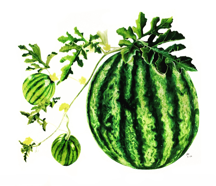
Take a look at this drawing of a Watermelon that I did last year. These colors are much cooler than the original reference and I increased the contrast (really dark shadows and really bright highlights) and made this drawing really pop away from the page.

For Patreon members, you can watch the tutorial for this drawing here: https://www.patreon.com/posts/watermelon-in-1-27242254
So, remember- It is all about the VALUE!


Recent Comments