My Top 10 Tips for beginners
Colored Pencil Drawing Tips
This advice comes from my personal experiences as a Colored Pencil beginner and this is what I would tell my past self.
To come up with this list, I spent some time looking back at my earliest drawings and notes that I made in an effort to remember what I struggled with and what questions I had.
Hopefully, it will help you!
Tip 9- Value is more important than color
Why Value Matters More Than Color in Realistic Drawings
When I first started drawing, I spent a lot of time stressing over getting the color exactly right. I thought realism was all about matching the reference photo down to the perfect shade. But over time, I learned a surprising truth: value is far more important than color when it comes to creating realistic, eye-catching art.
So… What is Value, Exactly?
Value refers to the relative lightness or darkness of a color. It’s how we understand light and shadow in an image. Without strong value contrast, your drawing can end up looking flat—even if every color is technically “correct.”
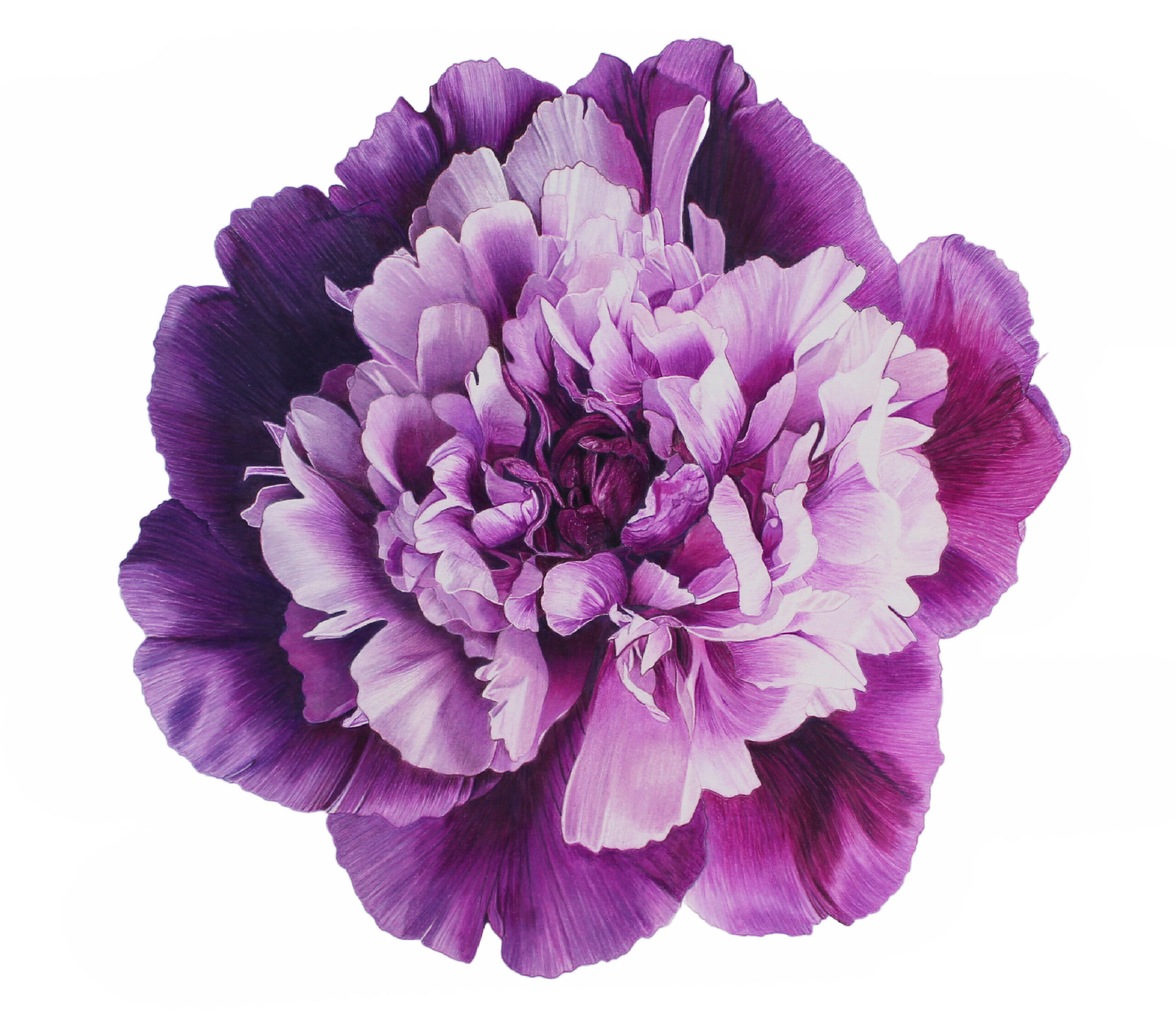
Notice how the dark value at the center of the Peony to the right adds depth and makes the center look like it is recessed into the flower.

Value Creates Depth
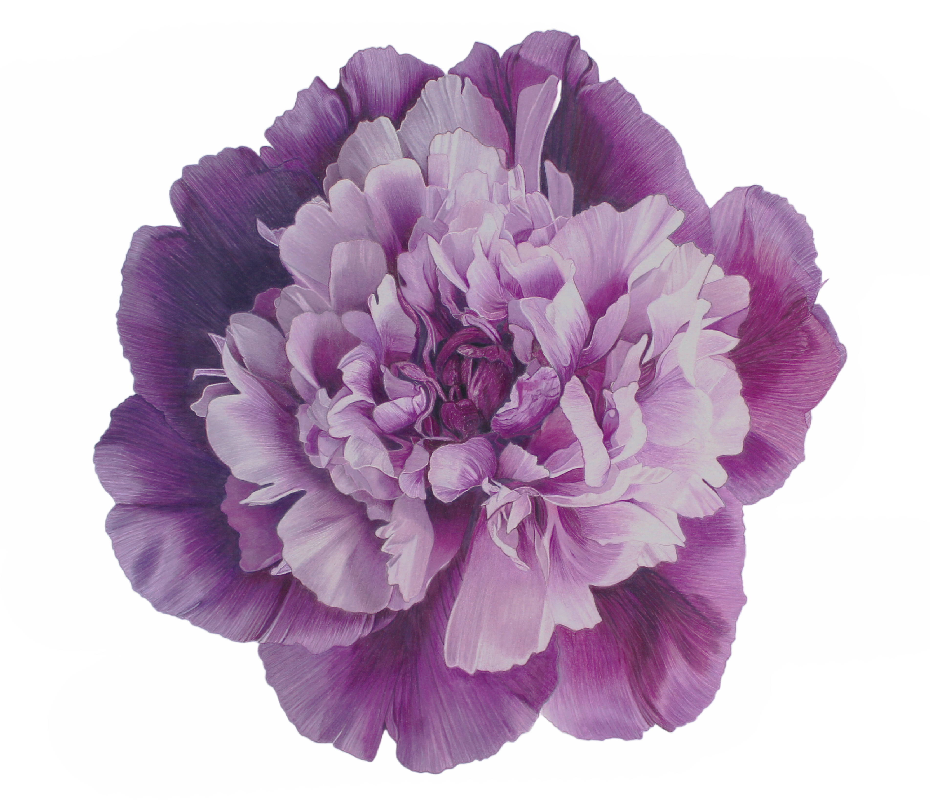
Compare the image to the right with the one above. I have decreased the contrast and the flower looks flat and one-dimensional.
Don’t be afraid of the darks!
In my experience, many new artists pay more attention to color than value. Let’s say you’re drawing a red flower, and you notice a shadow on one of the petals. You might assume, “I’ll just use Scarlet Red for that shadow since that’s the color I see.” But once you fill in the rest of the petal, that “shadow” no longer looks darker than the surrounding area—there’s no contrast. Which means… it’s not really a shadow at all.
Instead, choosing a red with a deeper value, like Tuscan Red, can help you create a shadow that actually reads as a shadow—even if it doesn’t perfectly match the color in your reference photo.

Try this practice exercise
You can darken the value of many colors by mixing them with a bit of gray. Take Prismacolor’s Scarlet Red and make a simple swatch. Now, layer that same Scarlet Red over Cool Grey 70%. You’ll end up with a deeper, richer red—same color, but a darker value. That’s the power of value at work. This tip works especially well with red, purple, blue and green.
The bottom line
You can have the “wrong” colors and still end up with a beautiful drawing if your values are right. But if your values are off—even if your colors are spot on—your piece can fall flat. So next time you’re working on a piece, try focusing less on finding the perfect color, and more on capturing the correct range of light to dark. That’s where the magic happens.

