Have you ever found the perfect reference to draw only to find that the colors you have available in your set do not match the colors in your reference? Say, for instance, you want to draw a red rose. Even with 10-20 different reds to choose from, you might discover that not a single one matches the shade you are searching for. They are all too orange or too pink, too dark or light, too rusty or brown or bright or dull. After a while, you might find yourself staring at your reference wondering, “Is that even red?”
This happens to all of us!
I recently drew a Red Rosebud from a reference that was originally yellow. I did this to show my students that you can use any of your colors to create a beautiful drawing if you focus on VALUE and TONE.
Here is the original reference image.

The first thing I did was convert this into a black and white image so that I could focus on the values, specifically, the shadows, mid-tones and highlights.
Here is my black and white reference.

Here are some tips that I like to use when deciding which of my colors to use in my drawings.
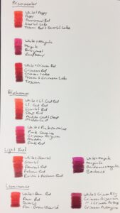
- Create Swatches. The very first thing I always do when I am deciding which colors to use in a drawing is to get out ALL of the remotely potential pencils that I might use and start creating swatches. When I do this, the ‘frontrunners’ quickly surface. I set aside all of the pencils that are completely wrong and start over with the smaller batch. I repeat this process until I have a much more narrow selection to choose from.
- Separate colors into Warm and Cool. When I am looking at red pencils, it is very helpful for me to separate them into the reds that tend to be more orange (warm) or pink (cool).
- Separate colors into Darker Values and Lighter Values. Start to look for colors that you might be able to use as a shadow or highlight. Keep in mind that if you don’t have a dark enough dark, you can add grey underneath to darken the value. (Try this on your swatch!) And, if you don’t have a light enough light, you can often add white to the mix to lighten the value. Keep in mind that value is relative. For example, a highlight does not necessarily have to be light or white. It just needs to be lighter than your mid-tone or shadow color.
- Look for colors that look GOOD together. I like to remember that if the colors look nice together on my swatch, they will look nice together on my drawing. I could have chosen any of the swatches below for my drawing and it would have been a beautiful rose because all of these colors look good together.
Here are some swatches I created from my red pencils. Notice that I have separated them into warmer and cooler tones and darker and lighter values.

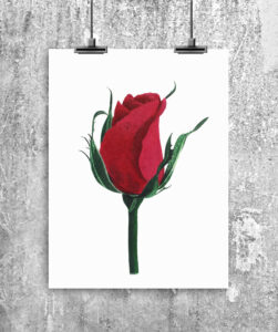
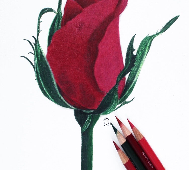
And, here is my final drawing. I decided to use a combination of Prismacolor and Polychromos pencils for this one. I used Polychromos Alizarin Crimson and Dark Red and Prismacolor Crimson Lake as my main mid-tone colors. I layered Prismacolor 90% Grey and Tuscan Red with Polychromos Dark Red in the shadows and added a layer of Prismacolor White under the ‘highlighted’ areas of the drawing.

You can watch the 5-part tutorial series for this drawing by subscribing to my Patreon page at www.patreon.com/jennifermorrisonart. And, you can watch a free, 15-minute preview by following this link: https://www.patreon.com/posts/red-rosebud-47626521
You can also find me on Pinterest, Facebook and Instagram by searching for Jennifer Morrison Art.
I hope you found this helpful! I am planning to add more blog posts about color and color choice in the future, so stay tuned! Please leave questions in the comments section below and I am happy to reply.
Jennifer


Recent Comments