
Color Palette vs. Color Matching
Which color should I use first? As a colored pencil drawing instructor, this is one of the questions I hear over and over. This question can prevent a beginner from even starting. So afraid they are going to ‘do it wrong’ or ‘mess something up’.
Would you believe me if I told you that it doesn’t matter?
Okay, it does matter. A little. But not nearly as much as you might think.

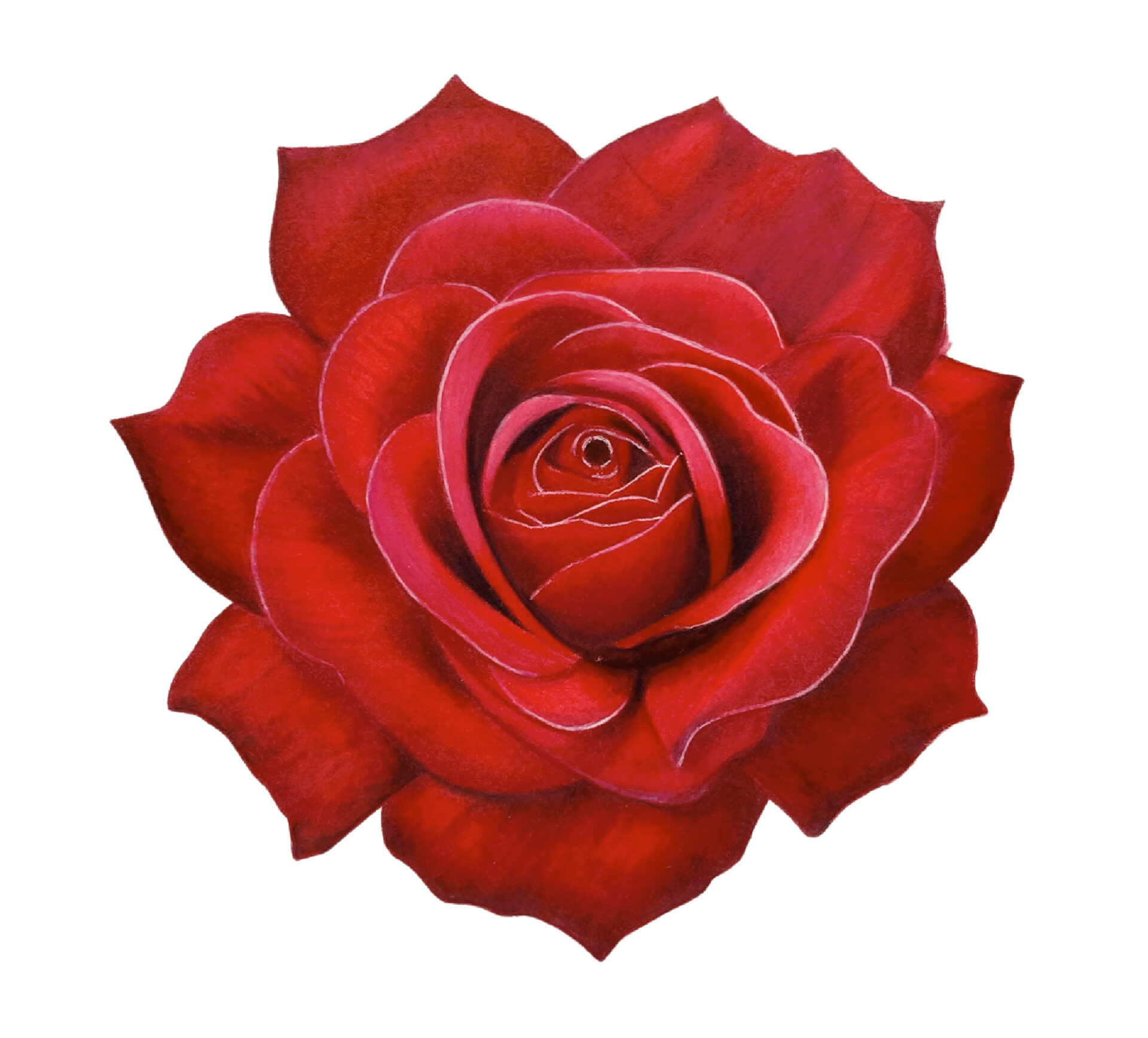
The top rose is the actual drawing. The bottom rose is another pretty shade of red.
Why Color Choice Matters
- The order in which you apply your colors will often have an effect on the resulting color.
Why Color Choice
Doesn’t Matter
- Who cares? I honestly really don’t. Your red flower might be a slightly different shade of red than my red flower. Both are beautiful red flowers.
- It is SO hard to create a PERFECT color match when using colored pencils. And it matters SO little in the end that it usually isn’t worth the extra effort it requires to try.
- In some cases, it might actually be impossible to create a perfect color match. You might be working with a limited selection of pencils. You, like me, might not completely understand the complexities of Color Theory.
- Blending colored pencils is not the same as blending paint. You can mix colors to create a second or third color but you can’t continue to do this endlessly the way you might be able to with a liquid medium.
- If I start a drawing by looking at a flower and then I take a picture of that flower and look at the reference image on my phone and then compare it to the same reference image on my iPad or laptop or a printed version of the reference, they will all be different! When I share my reference image with you and you print it out or look at it on your phone or computer, it will look different than mine does. Many things can affect how the image appears on a screen including brightness, calibration, and saturation. Each device creates a slightly different color profile. So, even if you and I perfectly color match to the exact same reference image, our drawings will look different. Why bother?
- No one else is looking at your reference image. After you finish the drawing, you will likely discard the reference and never look at it again. You will quickly forget what color it was supposed to be. Your version will be the right version.
For years and years, I tried to color match. I would look at my reference image and then do my best to replicate the colors as closely as possible on my drawing. This took, well, a long time. This process can bog you down and cause you to lose sight of the overall drawing. And, most importantly, your drawing will not look any better for it!
What do I recommend instead?
Want an easier way? Try creating a color palette.
Creating a color palette saves so much time and gives your drawing a cohesive look.
When you create a color palette, you choose a set of colors to work with that includes shadows, mid-tones, and highlights. You try to get as close to your reference as you can within reason. When you look at the colors together on your palette, they look great. Then you know they will look great on your drawing.
How to create a
color palette using
colored pencils
- Start with a small piece of the same paper you will be creating your larger drawing on.
- Get your pencils out.
- Open up the reference you are going to draw.
- Look at the reference and look at your pencil options and start creating swatches.
- Match the swatches to your reference and start narrowing things down- this works, this doesn’t, this is too warm, this works for a tiny part over here but clashes with the rest of the colors, etc.
- Finalize your swatch. When you hold the final swatch up to your reference does it look like a match overall? Do you like the way the colors look together? If the answer is yes, you are done.
- You have a palette.
How to work from a color palette using colored pencils
Look at your reference. Pick the closest color and start drawing. When you are ready to draw a shadow, for example, you aren’t trying to match the color perfectly. You just use the shadow color you have chosen. Continue to do this until you are done. I am not trying to simplify things here. That is actually what I do.
You Might ask…
That sounds good but as I was working through my drawing, I came to a spot that was different. None of the colors on my palette were even close.
What to do?
At this point, you have 3 choices.
1
Most of the time, I ignore it and just use one of the colors from my palette. Just pick the closest one and move on. No one will ever know.
2
Go back to your set and find another color. Your palette isn’t set in stone! Sometimes you just need that exact right color and that is okay, too. It is important to pay attention to value here. If none of the colors in my palette are dark enough, for example, I might need to go back to my set of pencils to see if something would work better. Just make sure any new colors you bring in coordinate well with your established palette.
3
Mix your colors. I can often mix a couple of colors together to come up with something closer to what I need. I do this all day long, with abandon. If I find a perfectly perfect mix, I will add it to the palette and make a note of it.
Color palette evangelist
So, you might be able to tell that I am very passionate about this topic.
Drawing should be fun! It should not be something that feels like a slog. Fear of using the wrong color should not prevent you from drawing.
And, if you choose to color match because that is what makes sense to you and works for your process then that is great, too! We can still be friends. We can learn from each other. My process continues to develop with every drawing.
I hope this post has helped you in some way. To learn more about my process and follow along with my tutorials, check out my Patreon page at www.patreon.com/jennifermorrisonart